

Introduction
Build SSRS(RDL) Report from Microsoft Report Builder Part 1 contains the introduction including necessary steps and description about how to add Data source, Dataset and tabular report using MS Report Builder. This article describes the straightforward steps to represent the data in the form of Bar graph and Pie chart in reports using Microsoft Report Builder tool which is an essential component of SSRS Report building process. Those reports can be published in Report Server of SQL Server reporting services (SSRS). Bar Graph, Pie char, Line Graph, Scatter plot etc. are more popular and useful to represent the data in Dashboard and Graphical Reports. This article will take example of total number of employee in each Branch and depict those in Bar graph and Pie Chart.
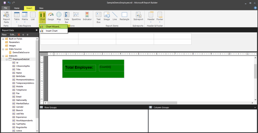
Bar Graph Design: To design chart, go to insert option click on chart and then chart wizard.
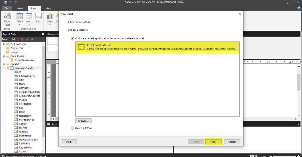
Select dataset and click on next
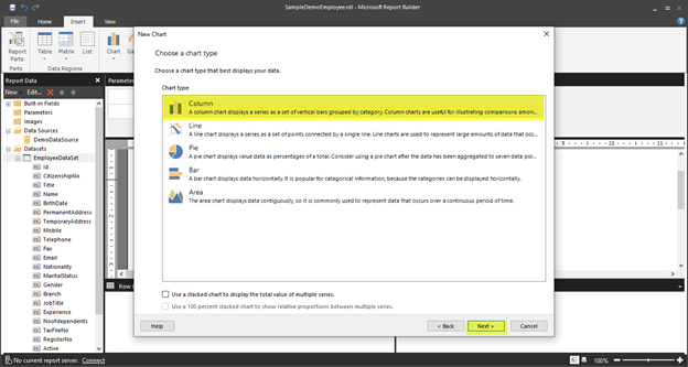
Choose type of chart and click on Next. I am going to select column chart for demo purpose.
In this stage, you can select the fields as per your report requirement. In this stage, you can select the fields as per your report requirement. In my case, I am going to show no of employee available in each branch. Thus, I have dragged Id field in values and Branch in Categories. After that Click on Next.

Click on Chart Title and give name of your chart

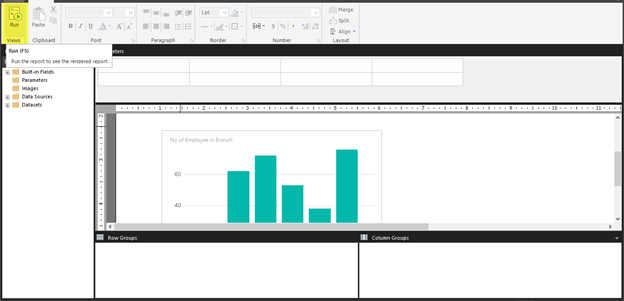
Now, it’s time to run and see the report. To run the report, Click on Run. Your report will look like as shown below.

To show value of each branch in the graph on top of bar -> Right click on the bar graph and click on Show Data Labels.

Run and see the result. Now you can see value of each bar in the graph.

Pie Chart: Now, we will learn how to add Pie chart in report. To add Pie chart, similarly, go to chart and select chart type pie, choose shape of pie here I am going to choose doughnut shape pie chart.

Select Value as Count(Id) and Category Group as Branch as illustrated below.

Right click and select Show Labels Data to show value inside the pie chart.

Now, Let’s run and see the report.

Conclusion
In this way, we have represented number of employees in different branch in Graphical view: Bar graph and Pie chart. Overall, this article described detailed steps of designing Bar graph and Pie chart in reports using Microsoft Report Builder tool one of an essential part of SSRS reports with an example of number of employees in Branch.
